Image: Clair Strong Interior Design
It’s time to look forward to the coming year’s interior design trends. At the International Home and Housewares Show back in March, Pantone’s executive director Leatrice Eiseman revealed the colour trends we may well be seeing in 2018.
They announced eight colour groups Pantone at the show: Playful, Discretion, Verdure, Far-Fetched, Resourceful, TECH-nique, Intricacy and Intensity. Last week I introduced the first four, you can read all about them here. Now let’s meet the final four…
Resourceful
This palette consists almost entirely of varying shades of orange and blue – complementary hues on the colour wheel. The juxtaposition of warm and cool tones really draws the eye in, so this is very much a ‘statement’ colour scheme. It can look whimsical and playful or cool and retro, depending on the shades chosen. I’m a big advocate for using unexpected colour combinations in unexpected places, such as the kitchen or utility room.
TECH-nique
In a world where homes are becoming smarter than phones, it seems almost inevitable that Pantone would create a tech-inspired colour palette. This group is made up of bright, loud hues that according to Eiseman “seem to shine from within”. Hot pink, electric blue and vivid turquoise feature heavily and are prevented from becoming too overbearing with grounding shades of pure white and almond beige. It’s a fun, fresh and modern colour scheme, but it’s not for the fainthearted.
Intricacy
At the International Home and Housewares Show, Eiseman declared metallics the “new neutrals”. This palette supports that theory with a wide selection of metallic hues accented by black, berry red and an almost sulphuric yellow. It’s a luxurious colour scheme – not flamboyantly bright like some of the others, but not exactly shy and retiring either. It’s the perfect choice if you want to infuse a little dark glamour into your home.
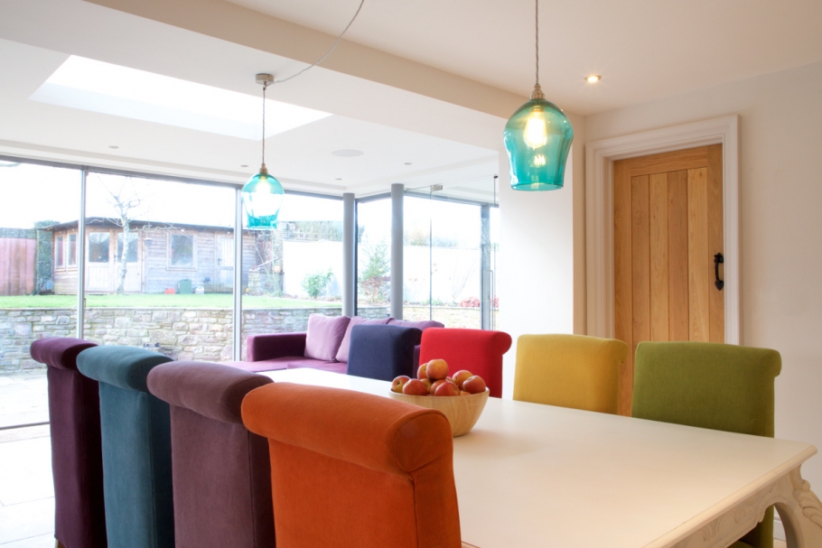
Intensity
I love this palette – it’s a really well chosen eclectic mix of colours designed to evoke feelings of strength and power. Cool shades of plum, blue and teal react with fiery shades of orange and yellow which is then all anchored with dramatic black and gold accents. It can be light and charming or dark and moody but there’s this overall sense of sophistication. It’s possibly the most versatile colour group of the bunch.


Comments are closed.