Image: Clair Strong Interior Design
Autumn has well and truly arrived so I’m looking ahead to next year’s interior trends. Today I’d like to talk about colour. At the International Home and Housewares Show back in March, Pantone Colour Institute executive director Leatrice Eiseman revealed the colour trends we could be seeing next year.
They announced eight colour groups Pantone at the show: Playful, Discretion, Verdure, Far-Fetched, Resourceful, TECH-nique, Intricacy and Intensity. Read on to find out about the first fab four. Come back next week to meet the rest…
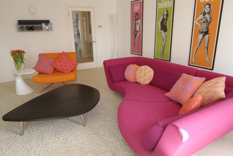
Playful
Vibrant, schoolroom colours like Minion yellow, lime green and cobalt blue combine to create this fun, stop-and-stare colour scheme. This colour scheme is excellent for a child’s room or nursery where such playful hues are sure to charm. Or you can combine these colours with vintage and modern furniture for a retro inspired living room.
Discretion
This colour group gives a nod to recent pastel trends, proving that they will never entirely go out of fashion. It is very much the antithesis of Playful, with a subtle selection of delicate, desaturated hues. Blush pink – the popular neutral of the moment – features alongside romantic tones of lilac, pale yellow, sage green and rose. It’s an elegant Marie Antoinette inspired scheme, ideal for the sanctuary of the bedroom or bathroom.
Verdure
Verdure has been widely described as a nature-inspired palette symbolic of health. It certainly lives up to its name with plenty of lush vegetable hues. No less than three verdant shades of green work in pleasant contrast with a slightly smaller selection of purples, yellows and a singular eggshell blue. The end result is an uplifting, jewel-like scheme perfect for any room that requires a pump of positivity.
Far-fetched
Far-fetched is a warm and earthy colour group that “reaches out and embraces many different cultures,” says Leatrice Eiseman. With colours like ruby wine, cornsilk yellow and burnt orange it is a deeply enticing and comforting palette. Texture and pattern seem almost as important to this scheme as colour, with fabrics like velvet and linen and intricate geometric prints enhancing the global sentiment.


Comments are closed.