It’s that time of year again! Autumn is when I start to look at the predicted trends for the next year and pick out a few of my favourites. Today we’re looking at colour.
Overall, we’re shifting from cool tones, like grey, white and blush pink to richer, earthier hues. There’s a definite move towards colour palettes inspired by nature, as well as lots of vibrant accents to brighten homes and work spaces.
Interior design trends are often influenced by what’s going on in the wider world, so as well as natural colours, there appears to be a stronger demand for eco friendly paints. And we can’t ignore that a lot of the trending colours are really cheerful; a direct contrast to the political atmosphere at the moment.
But enough chatter, let’s get to the good stuff! Here are five I think are likely to be popular next year:
Neo Mint
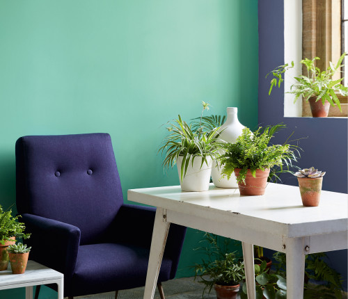
Green Verditer paint by Little Greene
Neo-mint is a fresh take on a classic pastel hue. It’s punchy, rich and retro – a really fun accent colour for living rooms, kitchens and bathrooms. Neo-mint is Tranquil Dawn’s striking younger sister and it pairs especially well with the next colour on this list…
Petrol Blue
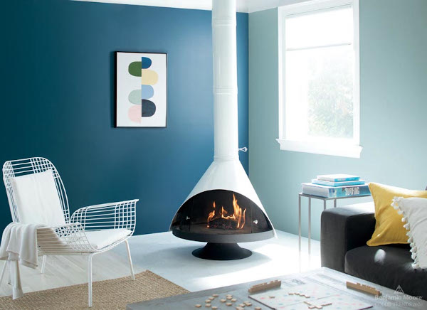
Blue Danube paint by Benjamin Moore
I think inky petrol blues will be everywhere next year; varying from light, washed out shades to a deeper naval tones. Petrol blue is classy, sophisticated and very versatile. You can pair it with neo-mint for a retro inspired space, or with dusky pink for a warm, contemporary vibe.
Dusky Pink
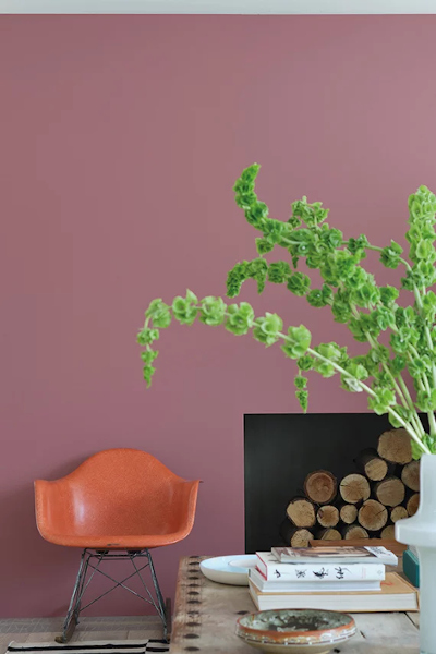
Crimson Red from Farrow & Ball’s Colour by Nature Palette
Pink is showing no signs of waning in popularity, but it’s graduated from barely-there blush to this in-your-face dusky pink. Personally, I much prefer this tone which has much more depth and warmth than blush.
Zingy Yellow
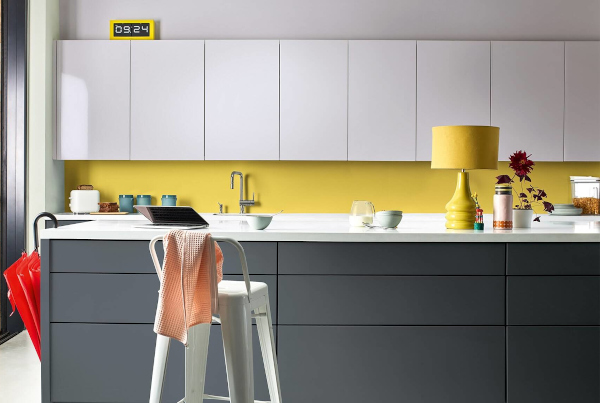
This vibrant yellow is the perfect accent colour. It’s fresh and cheerful but not too bright. Paint doors, furniture, picture rails or window frames in this sprightly hue for just the right amount of zing.
Almost Black
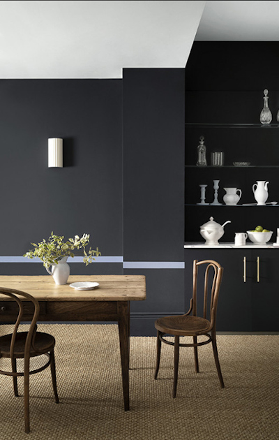
Beyond Blue by Paint and Paper Library
If you love black but feel it’s a bit overwhelming in the home, try an almost-black like the Beyond Blue pictured above. It contains blue pigments to tone down the harshness of black but still manages to create the drama of a dark interior.
What do you think? Will you be choosing any of these paint colours next year or do you have your own predictions for 2020 colour trends?


