Image source: Pantone
Every December Pantone announces its colour of the year for the following 12 months. A few weeks ago, they finally announced 2018’s colour and it is a good ‘un.
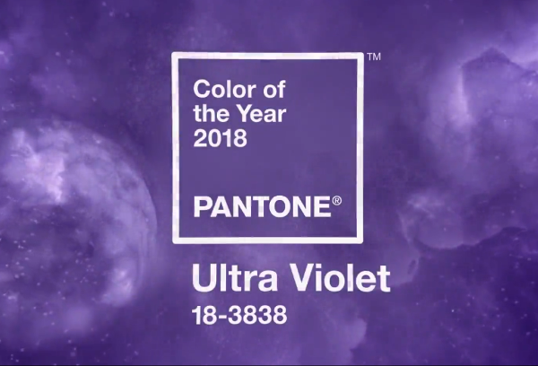
Ultra Violet is a rich and intense blue-toned purple that is evocative of far-away galaxies. It’s a colour that conveys mystery, intrigue, wisdom and creativity. It’s assosciated with royalty, and is known for being a spiritual colour, often used in churches, mindfulness practices and meditation rooms.
“Nuanced and full of emotion, the depth of PANTONE 18-3838 Ultra Violet symbolizes experimentation and non-conformity, spurring individuals to imagine their unique mark on the world, and push boundaries through creative outlets.” – Pantone
Ultra Violet in the Home
Ultra Violet is a great colour to decorate with but it’s not an easy one to get right. In interiors it can be sophisticated, luxurious and striking or it can look brash and overdone. And there’s actually a very fine line between the two. Because this shade is so striking it requires careful application. Here are a few rooms that got it just right:
This room masterfully combines several bright colours, plenty of wild, clashing patterns and lots of texture for a space the feels balanced and inviting. It could so easily look chaotic but the colour and pattern is anchored by those neutral white walls.
In this space we see only the smallest amount of ultra violet but it’s a very effective use of the hue. The desk is a beautiful splash of bright colour against the deep plum of the walls. This room looks stately and plush, but not tired and old-fashioned.
This room shies away from any sign of neutrality. It’s a dark and moody space with playful accents and bright hints of colour. Ultra violet and dark teal are perfect together, especially when combined with gold metallic accents. This room proves that to make ultra violet work, you really need to go all in.


