How to get colour inspiration
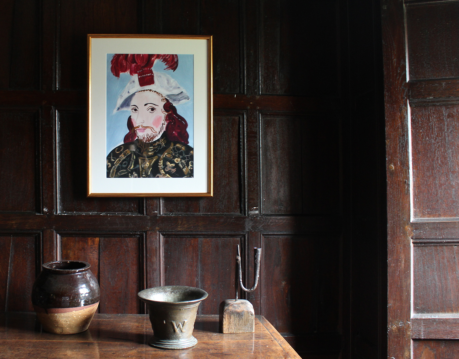
Choosing colour schemes is a complex subject. It is very much ruled by your emotional reaction to colour, but inspiration can be found anywhere if you have an eye for detail and design. My art and design background means art is an endless source of ideas; a painting can provide the colour scheme for a whole house.
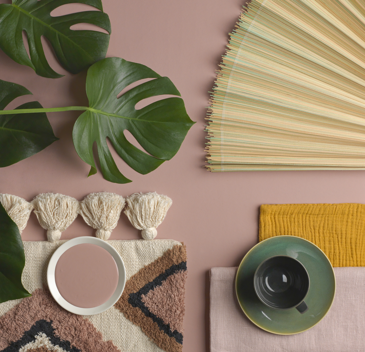
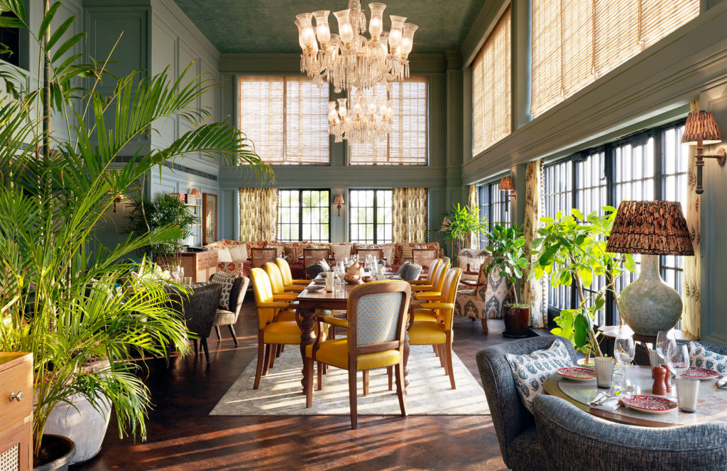
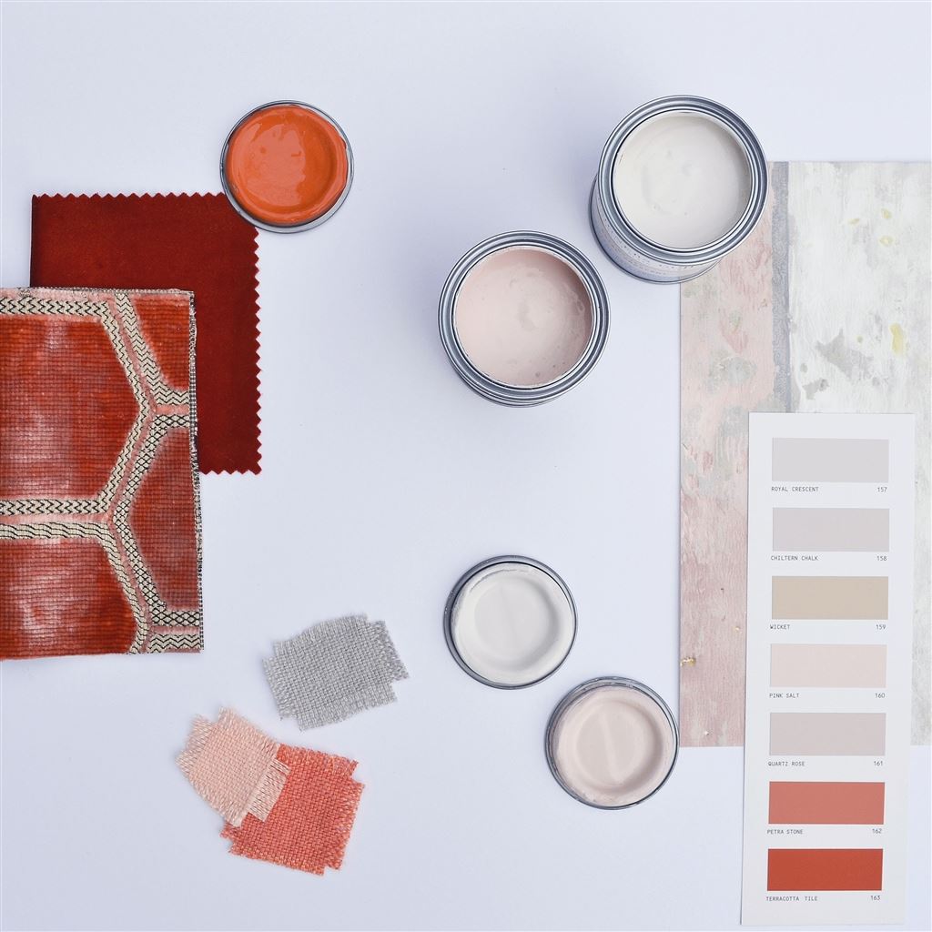
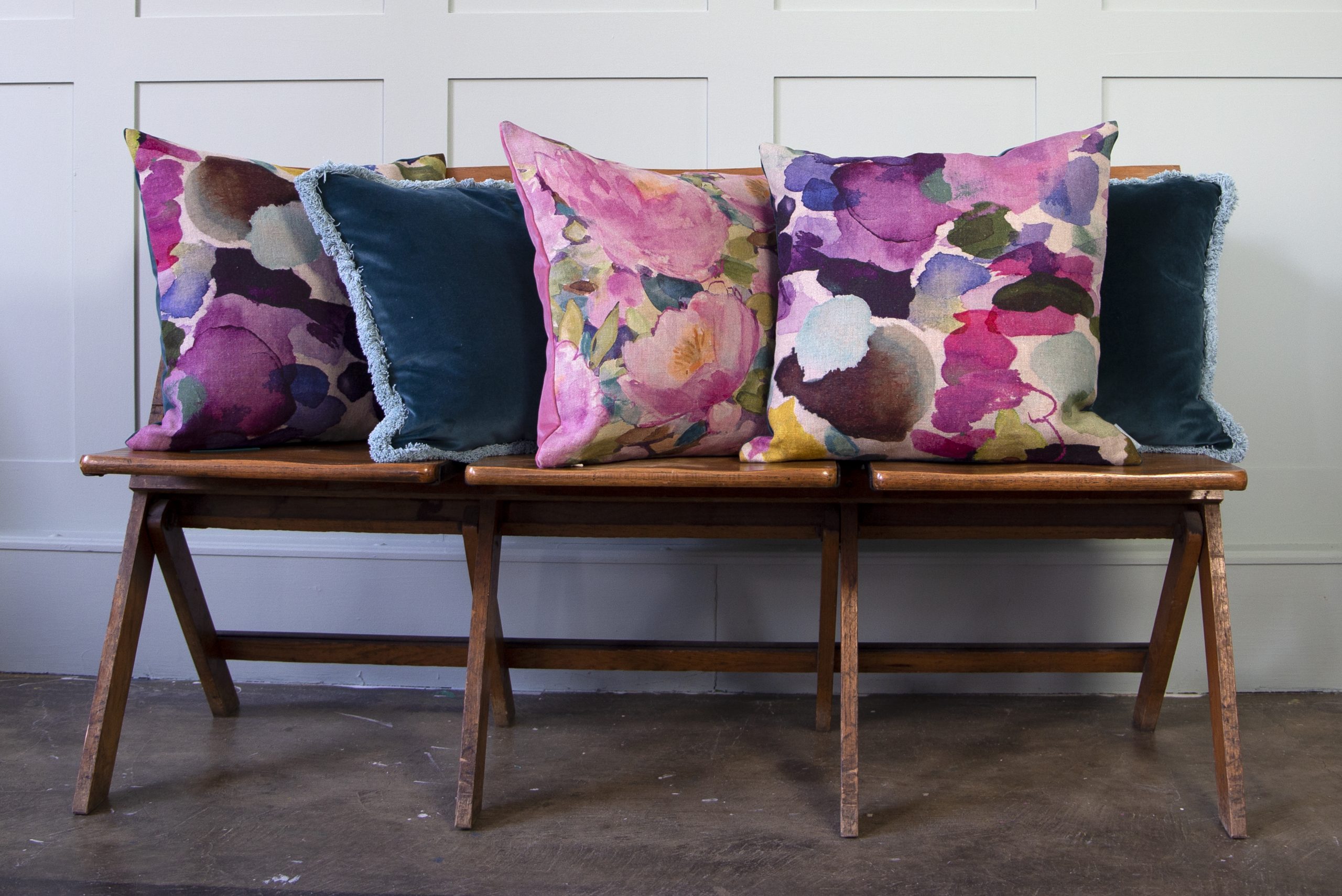
Anything can inspire me – a piece of fabric, an old postcard, vintage tableware, a book of bird photography. I love watching films and often find myself grabbing the remote to pause the action to home in on an interiors or costume detail. I also tend to get a lot of ideas from how restaurants and hotels use colour in different lights.
Nature also provides an unlimited supply of colour inspiration – if a colour scheme works in nature, it will work in your home. Look at what floral combinations work, or just get inspired by the colours of wildflowers growing naturally together.
Living in Bath, I often draw on historical references and reinterpret them in a modern way. Of course, our wonderful Museum of Fashion is a great source of inspiration. When I’m in need of more inspiration, I go travelling and take my camera!
If you are thinking about a new colour scheme you need to think about how you want the room to feel. Do you want to feel excited, content, happy, relaxed or comfortable in your room? What colours will help create that mood? Is there a certain shade or colour that sparks joy? Do you love a country you visit often? Is there a piece of artwork or photograph you love? A favourite film or outfit in your wardrobe? That’s your inspiration!
Pinterest and Instagram are great places to look for inspiration – and it doesn’t have to be an interior shot that dictates your colour scheme. Any images using colour combinations you love help to inspire your colour scheme.
How colours work together
Colours and moods
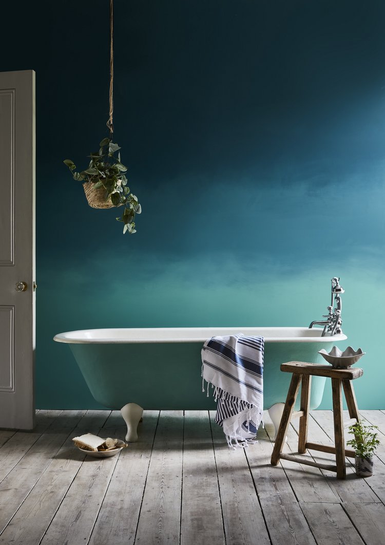
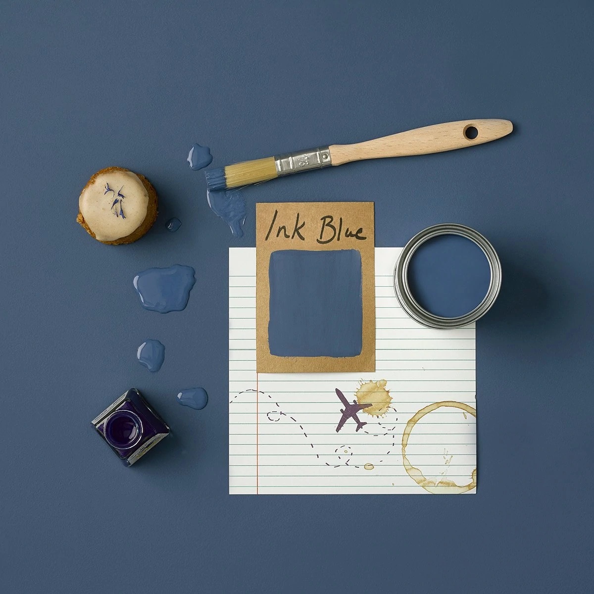
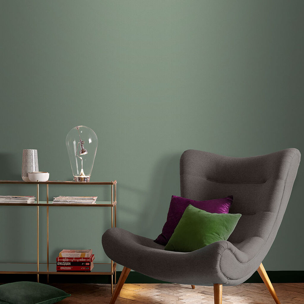
Remember when choosing colours that they affect emotional responses and create a mood. Greens are soothing colours, reds are passionate, yellows are uplifting, and pinks are delicate and feminine. Blue is the most popular colour to decorate with as its calming, while oranges are warm, and purple is spiritual.
Warm and cool colours
Colours are also warm or cool. In our minds, we perceive reds, oranges, and yellows as warm like the sun and fire and blues and green as cool because they remind us of water, sky, and trees. A mix of cool and warm colours often creates balance in a colour scheme.
Using a colour wheel
Have you ever wondered why some colour combinations look brilliant and others just don’t seem to work? The secret lies in colour theory, and the starting point for understanding this concept is the colour wheel.
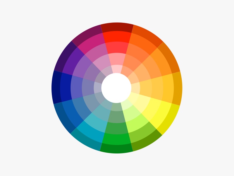
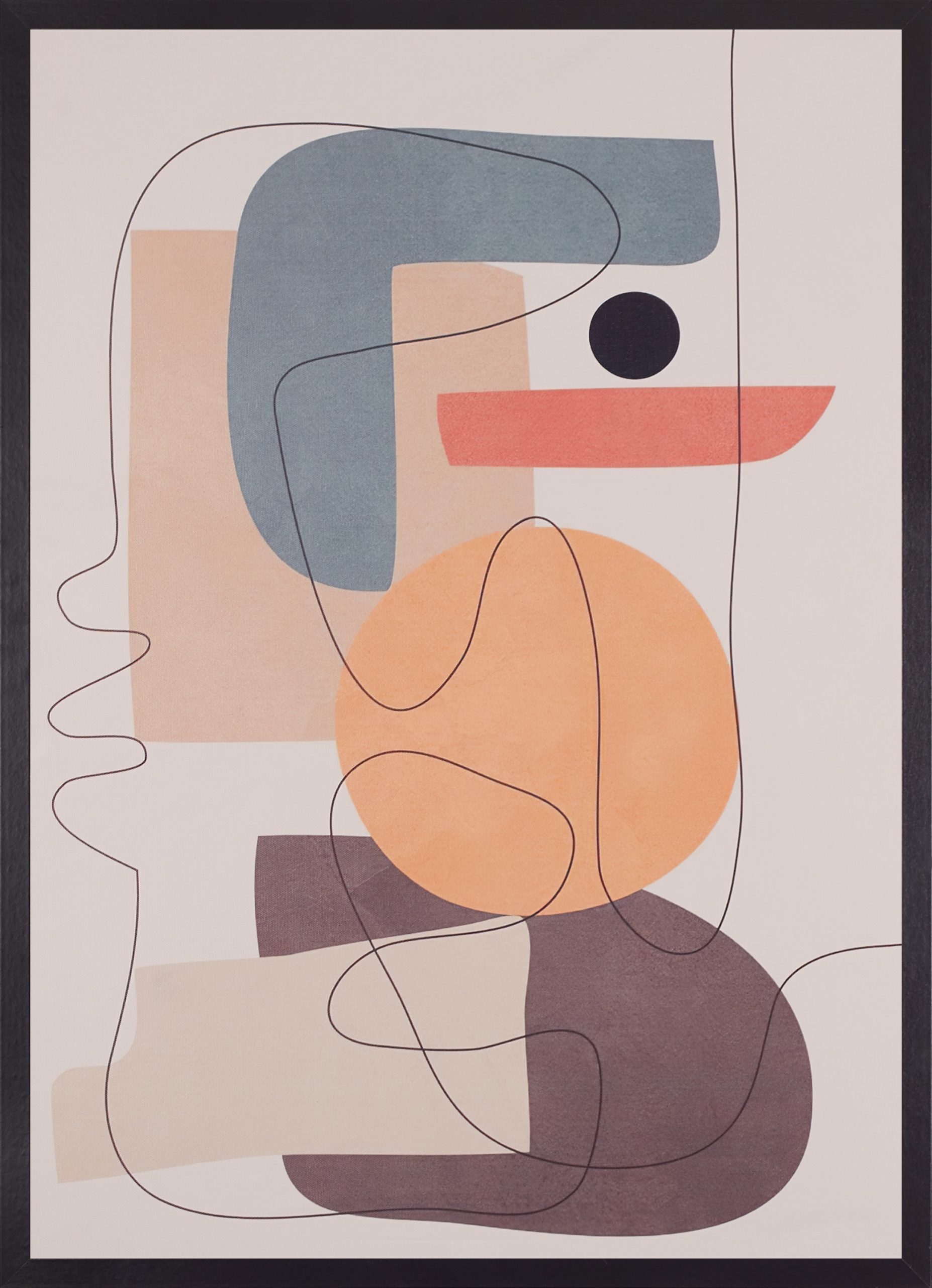
Using a colour wheel is a really brilliant way of analysing colour so that you can use it with more purpose and focus. Although it may appear a little mystifying at first glance, this handy tool visually demonstrates the relationship between colours. The colour wheel divides the colour spectrum into 12 basic colours: three primary (red, yellow, and blue); three secondary (orange, green, and violet); and six tertiary (yellow-green, blue-green, blue-violet, red-violet, red-orange, and yellow-orange).
To create your scheme, use your colour wheel to decide which colours will work in your home. There are several tried-and-tested combinations to choose from.
A monochromatic or tone-on-tone scheme uses several shades of a single hue to create a subtle serene palette (you are just adding black or white to the same colour). You can stick to light tones to create a relaxed delicate feel or go for dark tones for a moody, dramatic feel. Mix them up for a more energetic feel.
Colours that are opposite each other on the colour wheel are called complementary colours and create an energetic feel to a space. The key is to not let one colour overwhelm the other. This scheme will naturally include a warm and a cool colour, as they’re on opposite sides of the wheel. An example of complementary colours would be orange and blue.
An analogous colour scheme uses colours found side by side on the wheel, such as orange, yellow and green to create a harmonious relaxing scheme. Neighbouring hues work well together because they share the same base colour. This scheme benefits from having one dominant colour with the two remaining colours as accents.
A triad colour scheme uses three colours that are evenly spaced around the colour wheel (in a triangle shape). An example of a triad colour scheme would be turquoise, fuchsia, and orange. One colour should dominate while others are used as accent colours. Use your three colours in varying shades and tints to create more contrast or soften the brightness. Use a colour wheel to plan your colour scheme and you won’t go far wrong.
I hope you’re inspired to try some new colour combinations. Next week I look at planning and creating mood boards.


