What to consider practically
There are some interior design rules to consider when choosing colour. You must always consider the shape of the space, the quality of light and the function of the space when deciding which colour is best.
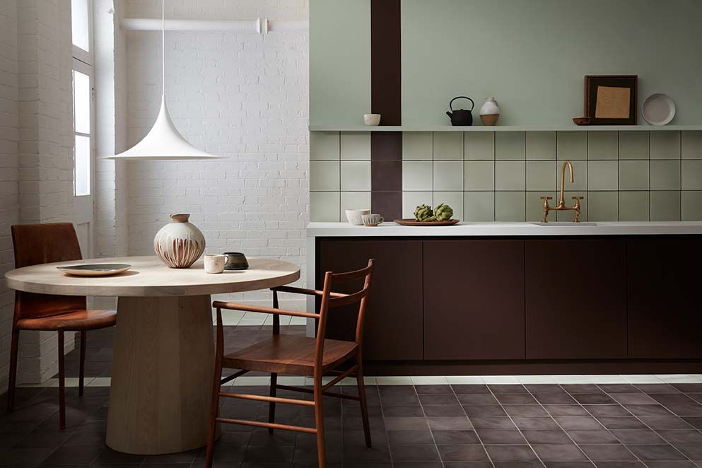
Our grey UK climate suits cooler, lighter colours that maximise natural light and space. Much as we’d love bright yellows and oranges in our houses, they are best suited to warm countries with lots of sunshine.
A harmonious house
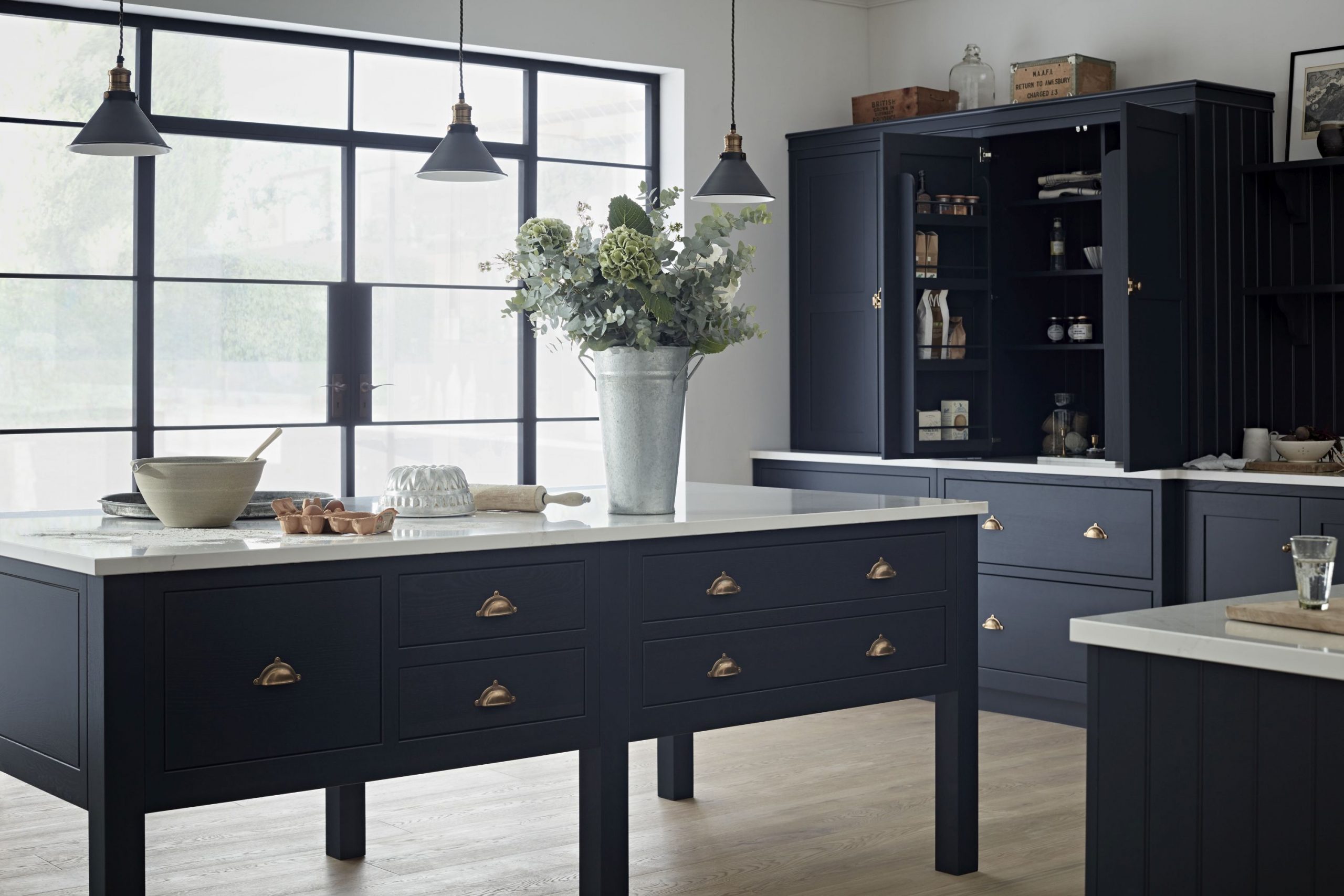
If you want to pull your whole house together, a great trick is to choose an overall colour for the whole house and repeat it from room to room to give a coordinated look. A dark grey kitchen in an otherwise white room, dark grey sofas in a dark moody room, pale grey and marble in a zen-like bathroom and soft grey and pink bedroom. You will get a lovely harmonious effect when the doors are open, and you can see into each room.
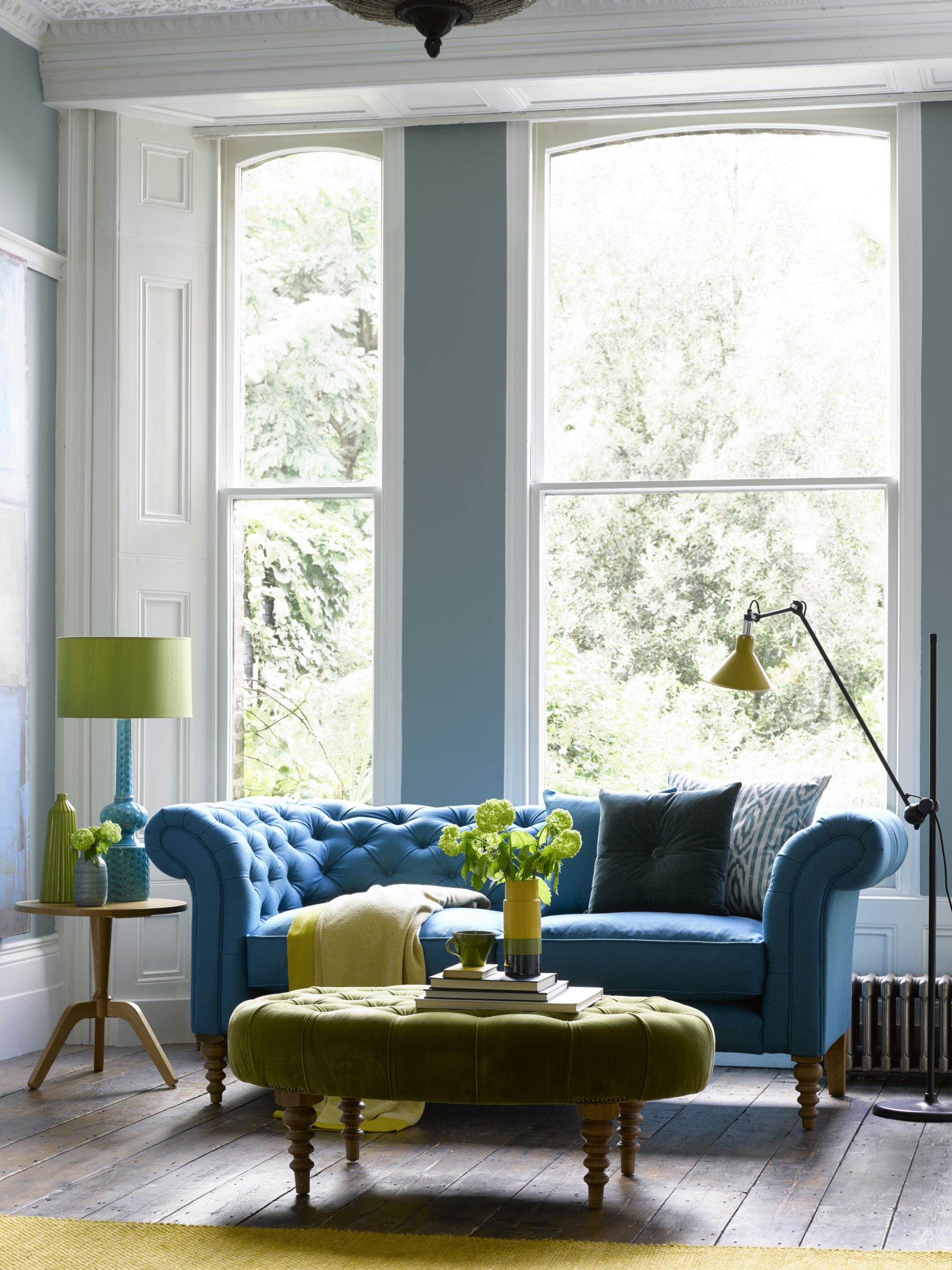
The 60-30-10 rule
The 60-30-10 rule is a timeless rule to use to make sure your colour palette stays balanced. The numbers refer to the percentage of each colour you use. It is a rule that helps create a colour palette for a space that will work time and time again.
The 60% is the main colour in a room. It’s often the walls or floors. This colour anchors the space and serves as a backdrop for the other colours in the scheme.
The secondary colour takes up about 30% of the space and is a bit bolder. You use half as much of this colour as your main colour. It could be your curtains or sofas, for instance. This secondary colour supports the main colour but is different enough to set give the room interest.
The accent colour is the boldest shade and takes up 10% of the space. For a living room, this could be your cushions or in a bedroom the lampshades.
Using the 60-30-10 rule can make choosing colour simple, and help you achieve balance in decorating.
How to start planning
Using mood boards
Creating a mood board helps you explore your ideas and work out the colours, style, mood and overall feel of your project. It collates all your ideas and inspiration together in one place and lets you see what works together and clarifies your design direction.
For interior designers, a mood board is the go-to tool for the initial planning phase of a space. It helps us visually communicate our ideas to our clients and make sure our colour choices work.
All you need is a big piece of A3 paper or a large, plain notebook. The beauty of a mood board is that you can carry it around the house and see how your chosen colours work in different rooms at different times of the day.
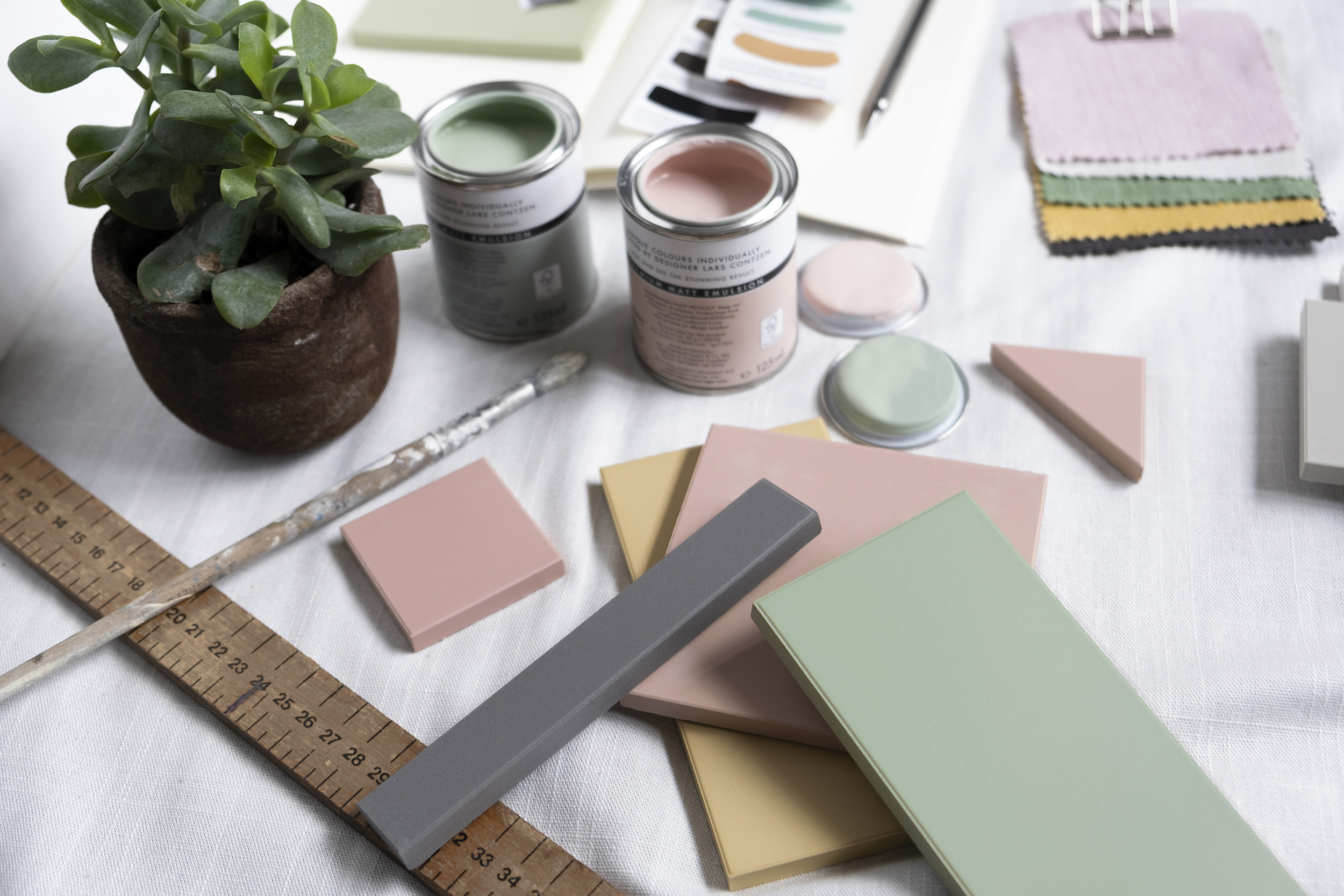
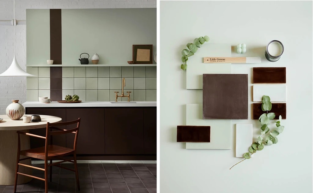
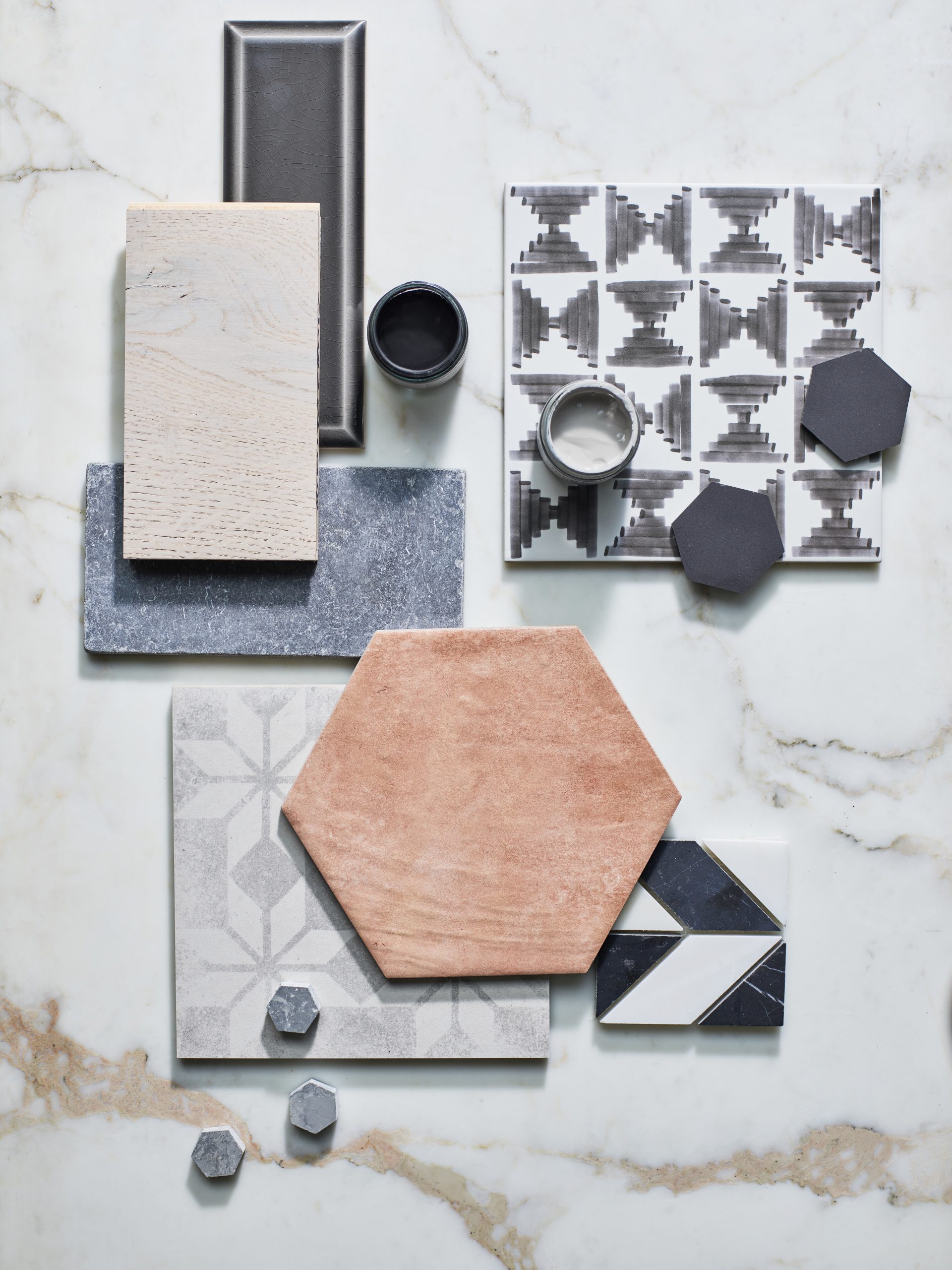
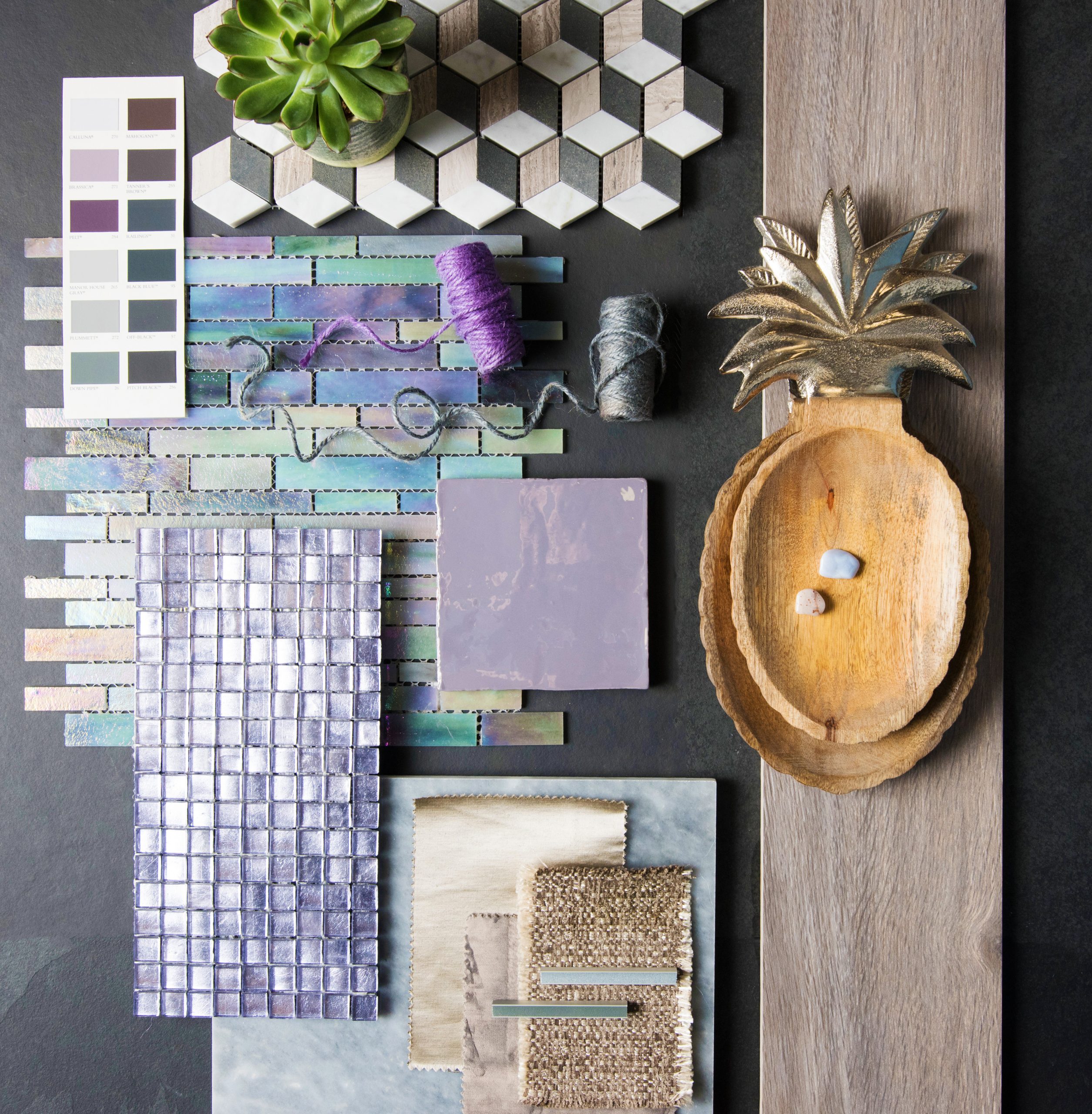
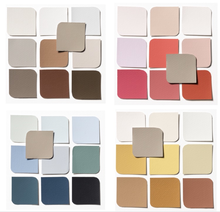
You make a mood board by gathering all your decorating ideas together and creating a mosaic of images. You can use images torn from magazines, natural materials, fabric swatches, paint samples, wallpaper samples, images from interiors brochures, tiles or pieces of flooring and paint samples.
When choosing a colour scheme, always start with a base colour. This is the largest area of colour in the room – so it can be the floor or the walls. Once you’ve chosen your base colour, the other colours in your scheme either need to be tonal colours, contrast hues or accent tones. Make sure you pick a large sample of your base colour to add to your mood board. Overlap your swatches and scraps of chosen materials so they look inspiring and take your time to play around with layering until you’re happy with the look.
Once your mood board is complete, take a step back and look at it. Then live for it for a few days. Keep returning to it to see if you are still happy with the look. Look at the colours in different lights. Show it to other people for feedback. Do you like what you see, and does it make you feel good? Tweak your ideas and swap in and out other ideas until it works for you.
If you like a more digital way of creating a mood board, try out Pinterest. You can just pin colour schemes, furniture and accessories that you like onto a board and work out what themes are coming across.
Once you are happy with your mood board, you are ready to design your room.
Using paint swatches
If you are planning to paint a room, you really must buy some paint samples and try them out. You don’t need to paint your walls with your sample colours. A large piece of cardboard is perfect. Simply paint it with two coats of your sample paint and stick it on your wall with masking tape. Don’t go too small. Colour swatches are best done in a 40cm square to fully show the colour.
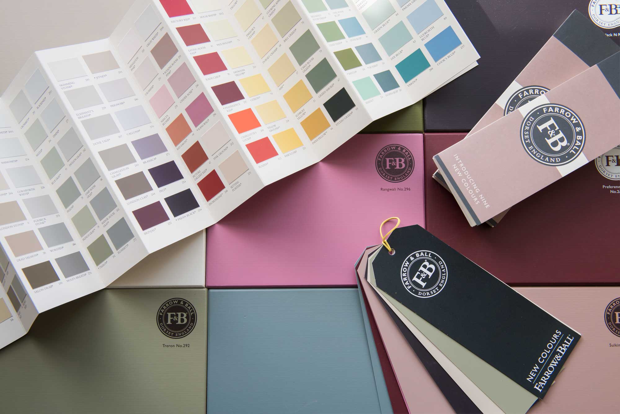
Don’t stick several samples next to each other; you need space between them to help your eye see each colour. See how your swatches look on different walls in different lights and think about what time of day you’ll be using the room, so you pick the colour that works best at this time of day.
I hope you have enjoyed reading about how I plan colour schemes. If you need expert advice, an interior designer like me can really transform the way you see your home and use colour.


