For most of us, the last year has been the most stressful of our lives but there is hope that 2021 will be the end of the pandemic.
Interiors trends for 2021 all focus on creating calm comfortable homes where we can escape the stresses of the outside world.
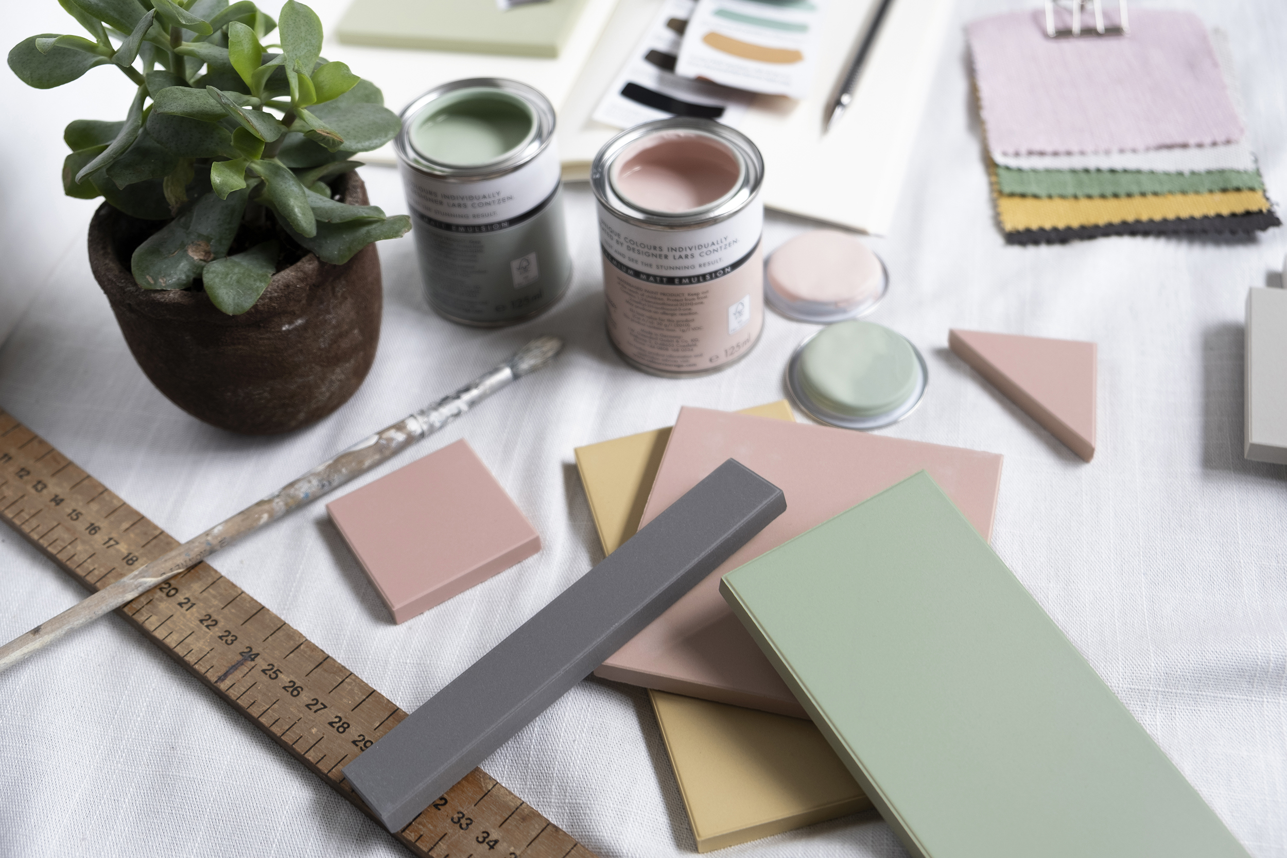
Colour psychology is key to how we feel. Science says that looking at colours can relax you. Different colours create different physical, emotional and psychological effects. While some colours are calming, others are stimulating.
Bright colours like red or dark colours like black stimulate our brains and fill us with energy, whereas serene colours like blue and green make us feel calm and relaxed. When choosing a colour scheme for your home, it is important to think about how you want to feel when you’re in the room. Here are my tips for using calming colours in the home.
Blues
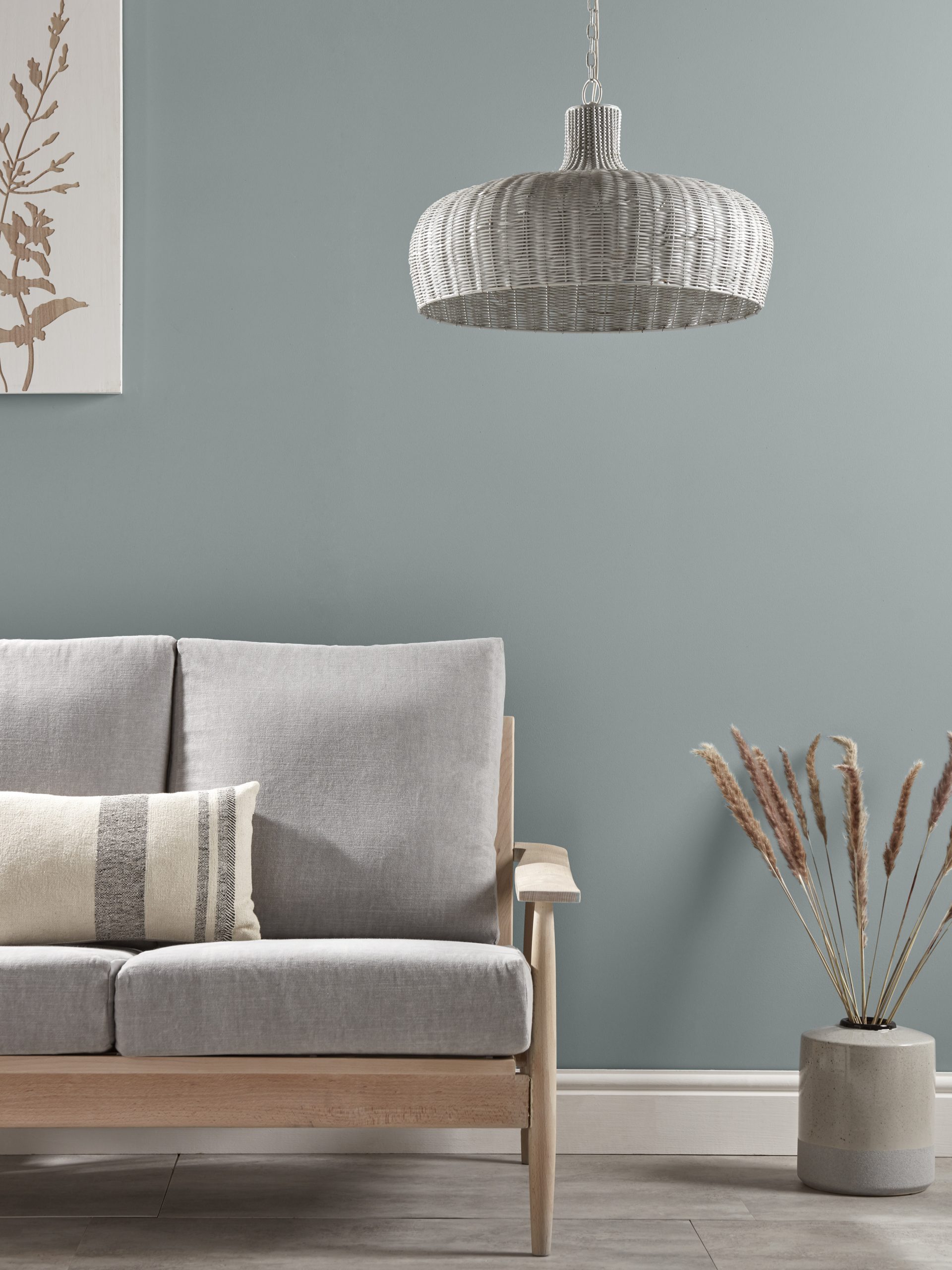
Blue is the most relaxing colour when it comes to decorating our homes. It’s a soothing colour which helps calm a busy mind. Think of looking up at the sky or at the sea on a sunny day. When we’re feeling stressed out, we subconsciously look to blue. Choose a blue with a warm undertone to prevent it looking cold and unwelcoming and stick to soft blues. Blues are great in spaces like bedrooms as they can help reduce stress and promote a good night’s sleep.
Greens
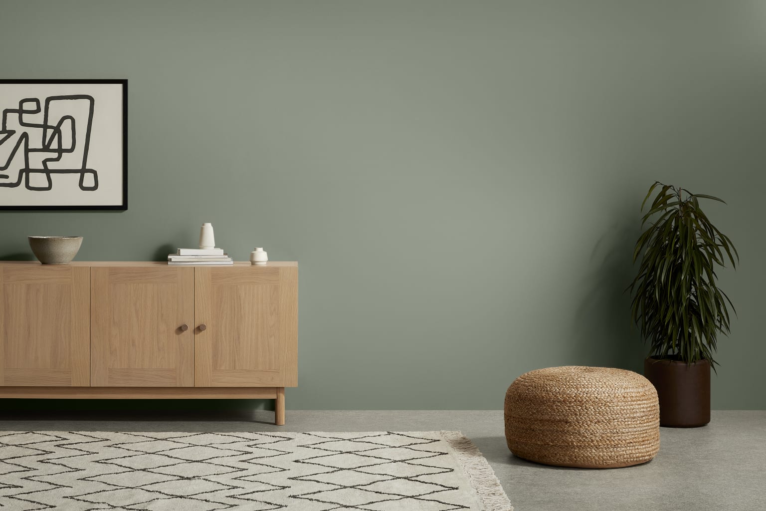
Green is the colour we associate with nature, energy and the Great Outdoors and so it’s the perfect colour choice to help you feel calm. Green is a quiet restful colour that can help you feel less anxious. Think of looking up at a canopy of trees, the expanse of green in a lovely park, a summer lawn and rolling fields; all relaxing spaces. Most shades of green are relaxing and darker emerald greens are very on trend for 2021.
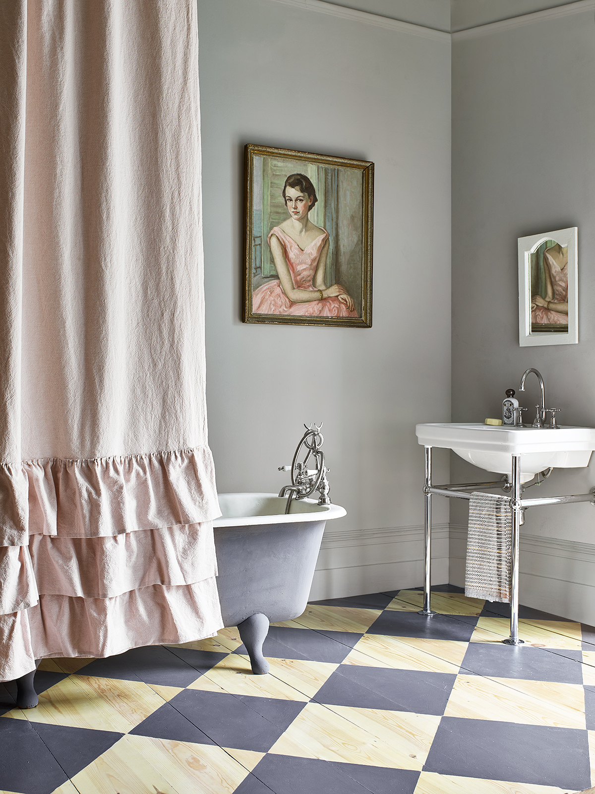
Pinks
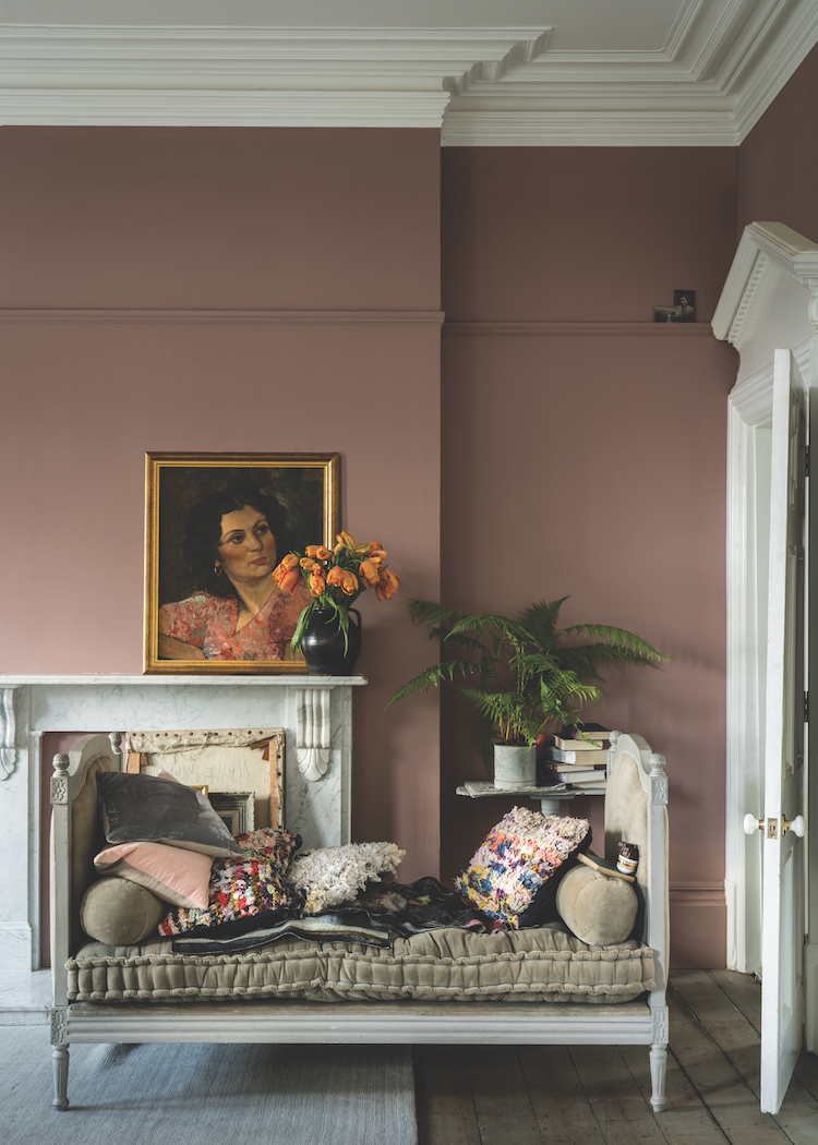
If you avoid bright vibrant pinks, pink is a restful calming colour. A soft muted pink can be a tranquil colour that creates a sense of balance and peace to a space. Pink is often thought of as a very feminine colour, but mixed with darker colours like a deep charcoal grey the right shade of pink can look beautifully fresh and modern. I’ve seen a ceiling painted in a very pale pink instead of white and it looked stunning. Go for dirty pinks for an elegant sophisticated take on the colour.
Purples
In many cultures, purple represents spirituality, wisdom and peace. Purple has a blue base, so it has many of the same qualities. Choose soft shades like a soft lilac for bedrooms and bathrooms to create a stress-free sanctuary. Lilacs and violets can be overpowering so mix them with blacks and metallics for a sophisticated glamorous look.
Whites
White symbolises purity and freshness and can inspire mental clarity. It is the perfect colour to be surrounded with in times of stress. Choosing the right white is key. A yellowy white can look dull, a bright white too clinical and a grey white can look dirty. Go for warm creamy whites to create a calming uplifting space.
Greys
People people think grey is a dull, boring colour but there’s a reason why it’s been such a popular colour for our homes in recent years – It’s such a versatile colour and the right shade of grey is very calming and relaxing. Grey is a great neutral colour, which works well as a great base colour with any brighter colours to create a cool, calming tone that won’t seem too overwhelming or distracting in any room.
Yellows
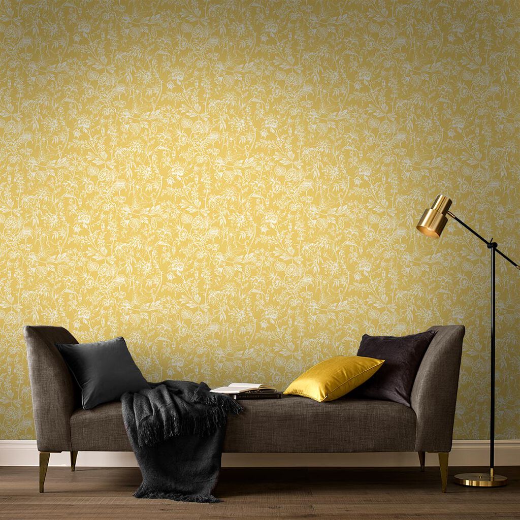
The colour of sunshine, yellow gives off energy and warmth. Yellow is softer than reds and oranges which can be very stimulating, but its still a colour that can improve your mood and counteract stress. A soft pastel yellow feels very soothing, like lying in a field on a summer’s day and is a great colour to warm up a north facing or cold room.
Use these colours in the rooms where you want to feel comfortable and relaxed. A bedroom sanctuary, a spa-like bathroom or a restful living space.


