Choosing colour schemes is a complex subject. It is very much ruled by your emotional reaction to colour, but inspiration can be found anywhere if you have an eye for detail and design. My art and design background means art is an endless source of ideas, but nature, travel, flowers, fashion, even just the colours in your favourite painting can inspire the colour scheme for your whole house. Here are some ways to help choose a colour scheme.
How do colours make you feel?
If you are thinking about a new colour scheme for a room you need to think about how you want it to make you feel. Do you want to feel excited, content, happy, relaxed or comfortable?
Pinterest and Instagram are great places to look for inspiration – and it doesn’t have to be an interior shot that dictates your colour scheme. Any images using colour combinations you love help to inspire your colour scheme.
Colours create mood
When choosing colours remember that they create a mood. Greens are soothing colours, reds are passionate, yellows are uplifting, and pinks are delicate and feminine. Blue is the most popular colour to decorate with as its calming, while oranges are warm, and purple is spiritual.
Warm and cool colours
Colours are also warm or cool. In our minds, we perceive reds, oranges, and yellows as warm like the sun and fire and blues and green as cool because they remind us of water, sky, and trees. A mix of cool and warm colours often creates balance in a colour scheme.
Use a colour wheel
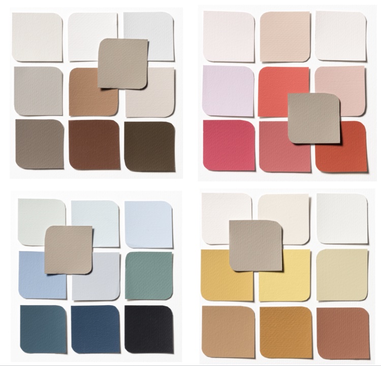
Have you ever wondered why some colour combinations look brilliant and others just don’t seem to work? The secret lies in using a colour wheel – this handy tool visually demonstrates the relationship between colours.
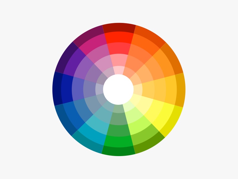
To create your scheme, use your colour wheel to decide which colours will work in your home. There are several tried-and-tested combinations.
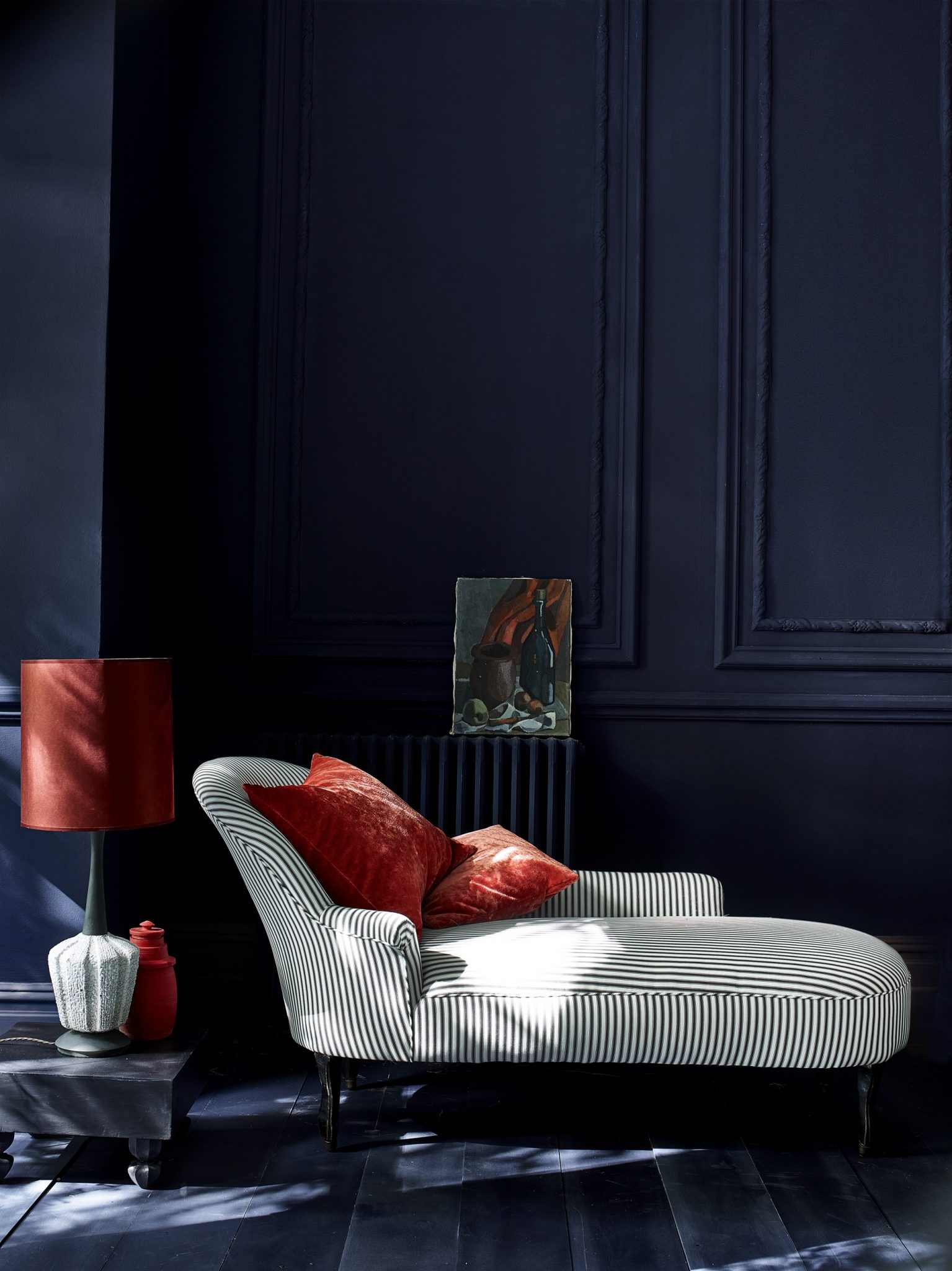
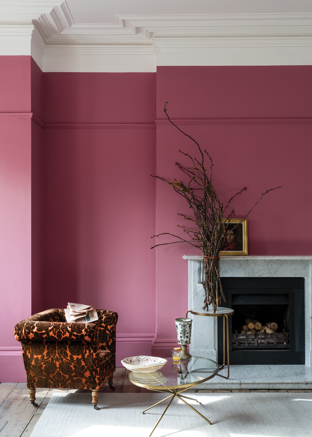
A tone-on-tone scheme uses several shades of a single hue to create a subtle serene palette. You can stick to light tones to create a relaxed delicate feel or go for dark tones for a moody, dramatic feel. Mix them up for a more energetic feel.
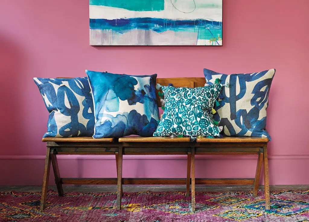
Colours that are opposite each other on the colour wheel are called complementary colours and create an energetic feel to a space. The key is to not let one colour overwhelm the other. This scheme will naturally include a warm and a cool colour, as they’re on opposite sides of the wheel. An example of complementary colours would be orange and blue.
An analogous colour scheme uses colours found side by side on the wheel, such as orange, yellow and green to create a harmonious relaxing scheme. Neighbouring hues work well together because they share the same base colour.
Rules around colour
You should always consider the shape of the space, the quality of light and the function of the space when deciding which colour is best.
Our grey UK climate suits cooler, lighter colours that maximise natural light and space. Much as we’d love bright yellows and oranges in our houses, they are best suited to warm countries with lots of sunshine.
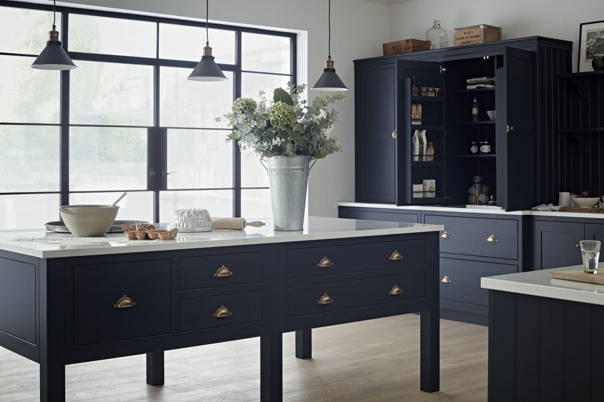
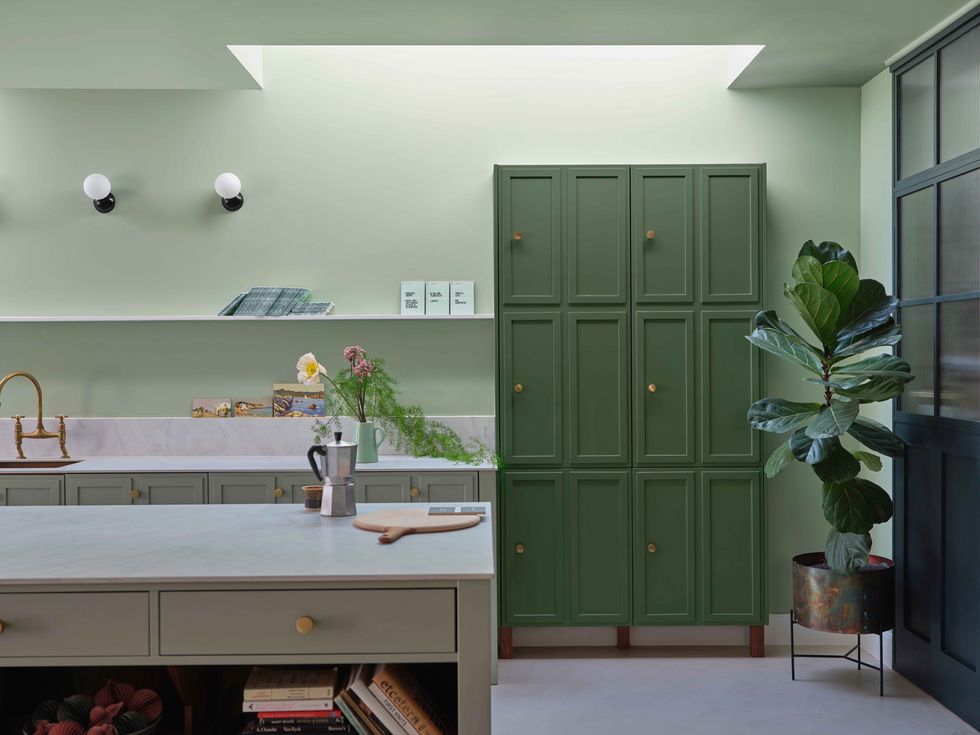
A harmonious house
If you want to pull your whole house together, a great trick is to choose an overall colour for the whole house and repeat it from room to room to give a coordinated look. A dark grey kitchen in an otherwise white room, dark grey sofas in a dark moody room, pale grey and marble in a zen-like bathroom and soft grey and pink bedroom.
The 60-30-10 rule
The 60-30-10 rule is a timeless rule to use to make sure your colour palette stays balanced. The numbers refer to the percentage of each colour you use.
The 60% is the main colour in a room. It’s often the walls or floors. This colour anchors the space and serves as a backdrop for the other colours in the scheme.
The secondary colour takes up about 30% of the space and is a bit bolder. It could be your curtains or sofas, for instance. This colour supports the main colour but is different enough to give the room interest.
The accent colour is the boldest shade and takes up 10% of the space. For a living room, this could be your cushions, or in a bedroom the lampshades.

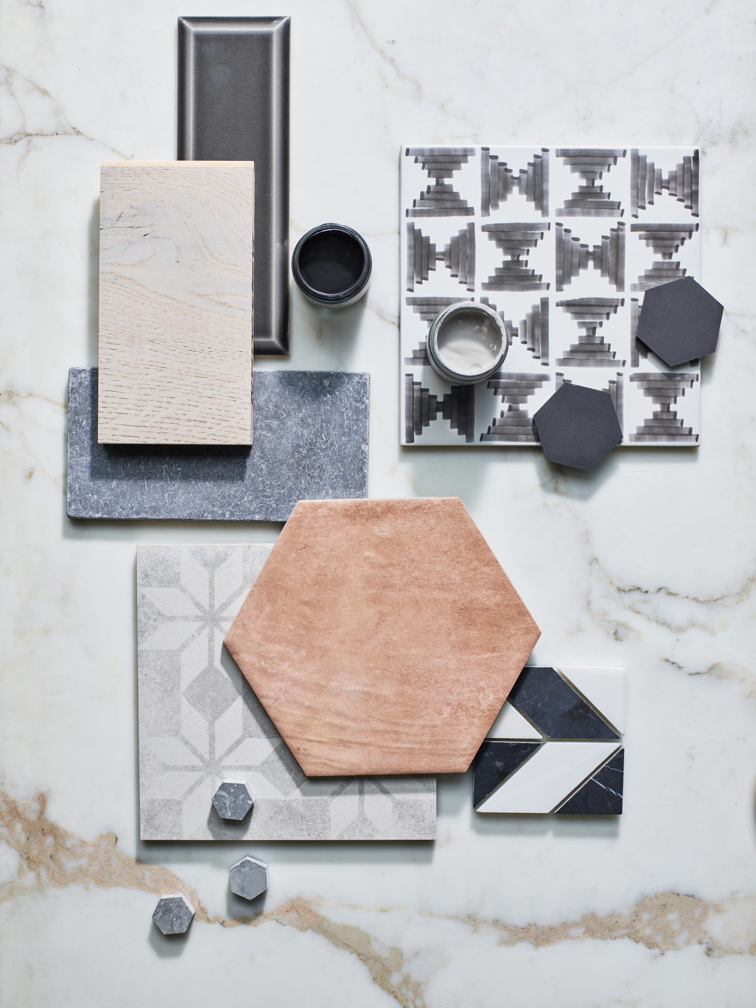
Using mood boards
Creating a mood board helps you explore your ideas and work out the colours, style, mood and overall feel of your project. It collates all your ideas and inspiration together in one place and lets you see what works together and clarifies your design direction.
Make a mood board by gathering all your decorating ideas together and creating a mosaic of images. You can use images torn from magazines, natural materials, fabric swatches, paint samples, wallpaper samples, images from interiors brochures, tiles or pieces of flooring and paint samples.
Once your mood board is complete, take a step back and look at it. Then live for it for a few days. Keep returning to it to see if you are still happy with the look. Once you are happy with your mood board, you are ready to design your room.
Using paint swatches
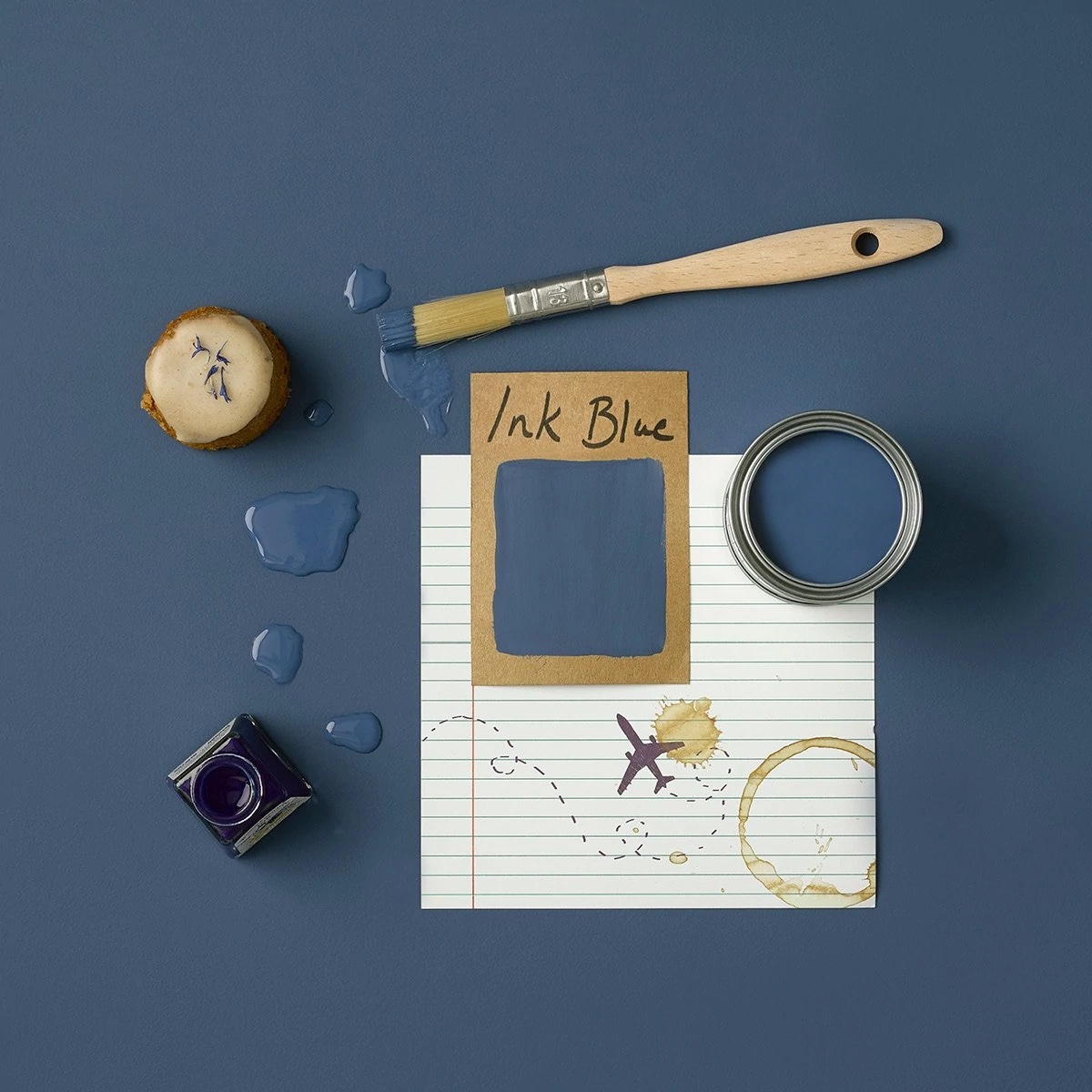
If you are planning to paint a room, you really must buy some paint samples and try them out. Colour swatches are best done in a 40cm square to fully show the colour.
Don’t stick several samples next to each other; you need space between them to help your eye see each colour. See how your swatches look on different walls in different lights and think about what time of day you’ll be using the room, so you pick the colour that works best at this time of day.
I hope that these ideas will help you start planning your colour scheme. Of course, the best way to ensure your choices will work is to work with an interior designer to plan your scheme.


