Image: Clair Strong Interior Design
It’s that time of year again. The world feels like it’s finally waking up after months of hibernation. The sudden rush of colour is one of the biggest benefits of spring. Not just in nature, but in fashion and interior design too.
The colours we most typically associate with spring tend to be pastel hued; soft, barely-there tones of blue, pink and yellow. Pastels can be wonderful but I know many people prefer a bolder look. Here are some of the colour combinations taking 2017 by storm:
- Lilac and Teal
OK, so lilac is technically a pastel hue but it’s not often used in interior design, making it an appealing choice. Combining this fresh, light colour with deep and moody teal creates an edgy but feminine grungy look. I’d also incorporate some brass elements (like this incredible bar cart) for a bit of glamour.
- Red, White and Blue
Elevate the blue and white nautical stripes of spring with a splash of brilliant red. This preppy combo is surprisingly versatile: it can look formal and traditional or modern and playful. Red is a really bold choice so this scheme is not for the fainthearted. You can, however, tone it down a little by using red sparingly in accessories like sofa cushions or lamp shades.
- Emerald Green, White and Charcoal
Emerald green is the kind of rich opulent colour we see a lot of in autumn and winter. By combining it with white (and a lot of it) we open it up and create a lighter, fresher feel. Sparing use of charcoal grey adds a bit of weight and grounds the entire scheme.
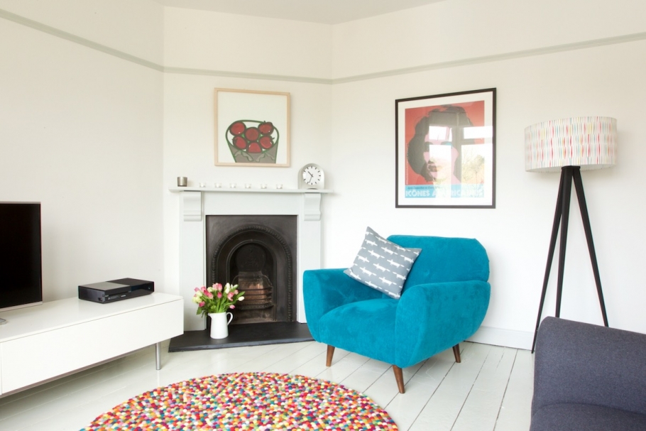
- A Little Bit of… Everything
Vibrant, multi-coloured spaces are officially on trend. Why choose just two or three colours when you can mix and match with as many as you like? To keep it looking cohesive, choose colours in the same tone, such as jewel or earth tones. I really like a vibrant tropical look for spring and summer, especially in the garden.
Which colour scheme will you be choosing this season?


Comments are closed.