Image: Clair Strong Interior Design
No home should be without a splash of pattern. Print adds depth and character to a room, gives it a relaxed and cosy vibe. Pattern is playful and bold. It has attitude and charm. It reflects the personality of the home owner. It’s the perfect way to dress up any neutral space – and as such is a renter’s best friend.
But pattern can be intimidating, especially when it comes to mixing more one than one print. So here’s a guide to provide inspiration and help you navigate the murky waters of decorating with pattern.
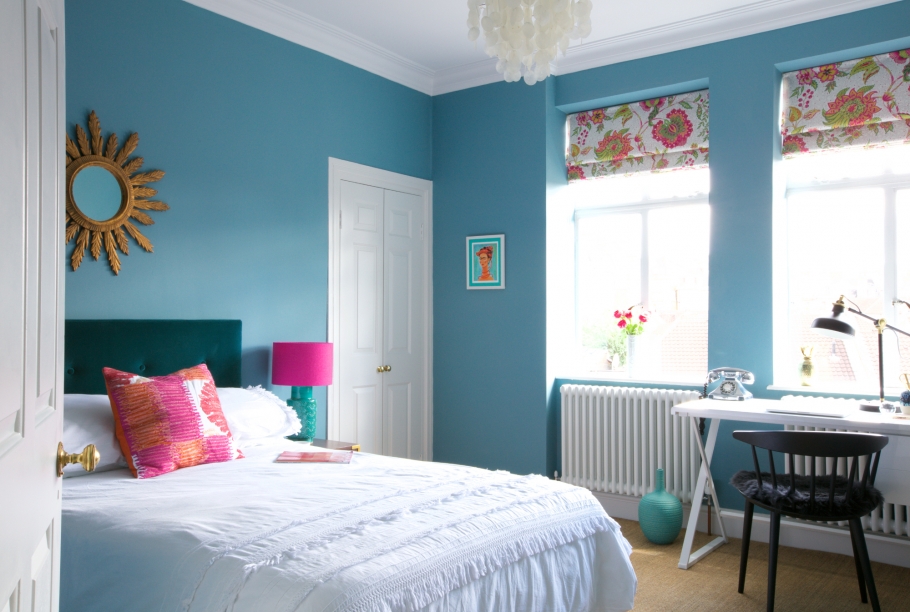
Choose a colour scheme and play with patterns within that palette. It works best when you stick to colours in a similar tone (pastels, neon, jewel tones etc) and leave the contrast to the patterns.
A neutral background provides a solid foundation on which to build layers of pattern. You don’t have to lavish the entire room in print to get the full effect – just a few pillows and blankets on a bed or sofa can be equally powerful.
If you prefer an ultra modern look – geometric patterns are the way to go. I’m a huge fan of pastel-hued geometric prints in kid’s rooms, but they look create an equally bright and cheerful effect in home offices and living rooms.
The key to successful pattern mixing is balance. Try pairing a busy pattern with a more subtle print and soften it all with solid colours. Creating a sense of scale is really important too – big, bold designs complement delicate patterns beautifully.


