Pantone’s 20th colour of the year is Living Coral, “an animating and life-affirming coral hue with a golden undertone that energizes and enlivens with a softer edge.”
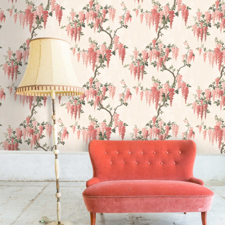
Image source: Woodchip and Magnolia
According to Pantone’s press release; “In reaction to the onslaught of digital technology and social media increasingly embedding into daily life, we are seeking authentic and immersive experiences that enable connection and intimacy. Sociable and spirited, the engaging nature of PANTONE 16-1546 Living Coral welcomes and encourages light-hearted activity. Symbolizing our innate need for optimism and joyful pursuits, PANTONE 16-1546 Living Coral embodies our desire for playful expression.
Representing the fusion of modern life, PANTONE Living Coral is a nurturing colour that appears in our natural surroundings and at the same time, displays a lively presence within social media.”
I have to admit, it is a cheering colour; vibrant but not overbearing, optimistic but not cloying. This near-neon hue will undoubtedly be popular on the catwalk and the high street (especially come summer) but in interiors it may only make it into glossy magazine spreads.
It’s a difficult colour, coral. Too much of it can look a bit retro-hideous and when paired with black it can become cartoonish. Blend it with burgundy and gold, however, and you’ve got a sophisticated, luxuriant effect. And paired with green it becomes lush and enlivening.
It’s early days, so perhaps I’ll be surprised and coral will end up everywhere. But I’m interested to hear what you think? Is Living Coral a hit or a miss?


